This post is a little different from my usual fare;
Basically, there was a tweet from MATRIX NI that caught my eye; the latest Office of National Statistics report on Internet Use in the UK.
@MATRIX_NI @ONS And the tables show Northern Ireland being around 7% behind the Avg and 2% behind the next-worst-region...
— Andrew Bolster (@Bolster) May 22, 2015Basically, NI “lost”. So I thought it was a good opportunity to play around with the data a little bit instead of my usual stuff.
As such this sent me on two main thrusts;
- Demonstrating a little sample of my normal workflow with data wrangling using Python, Pandas, Plot.ly and a few other tools. This is not clean code and it’s not pretty.
- NI Sucks at the internet and I believe this statistic is the more realistic, reliable, and impactful metric to target economic and cultural growth/stability/recovery/happiness/whatever.
Unfortuately the data massage, both in terms of dealing with the Excel data and then massaging the outputs into something the blog could safely handle took longer than I’d expected so the follow up will have to wait for another time.
Until then, well, here’s some data to play with.
“Open Data” sucks
When I’m working on something like this, I usually end up spending about 80% of my time just getting the data into a format that can be used reasonably; Excel documents are NOT accessible open data standards and they should all go die in a fire… But this is what we’ve got.
Lets kick things off with a few ‘preambles’.
In [1]:
import pandas as pd
import plotly.plotly as py
import statsmodels as sm

from sklearn.linear_model import LinearRegression
import scipy, scipy.stats

import cufflinks as cf # Awesome Pandas/Plot.ly integration module https://github.com/santosjorge/cufflinks

py.sign_in('bolster', 'XXXXXXX')
Pandas has the relatively intelligent read_excel method that… well… does
what it says on the tin.
Since every gov department appears to use Excel as a formatting and layout tool rather than a data management platform, there are lots of pointlessly empty rows and columns that we can drop, so we end up with the top of a data structure like this.
As you can see, Pandas has “guessed” that the top row is a set of column headers… this is incorrect…
In [3]:
df = pd.read_excel("/home/bolster/Downloads/rftiatables152015q1_tcm77-405031.xls", sheetname="4b")
df=df.dropna(axis=1,how="all")
df=df.dropna(axis=0,how="all")
df.head()
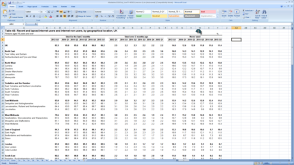
| Table 4B: Recent and lapsed internet users and internet non-users, by geographical location, UK | Unnamed: 2 | Unnamed: 4 | Unnamed: 5 | Unnamed: 6 | Unnamed: 7 | Unnamed: 8 | Unnamed: 10 | Unnamed: 12 | Unnamed: 13 | Unnamed: 14 | Unnamed: 15 | Unnamed: 16 | Unnamed: 18 | Unnamed: 20 | Unnamed: 21 | Unnamed: 22 | Unnamed: 23 | Unnamed: 24 | |
|---|---|---|---|---|---|---|---|---|---|---|---|---|---|---|---|---|---|---|---|
| 0 | Persons aged 16 years and over | NaN | NaN | NaN | NaN | NaN | NaN | NaN | NaN | NaN | NaN | NaN | NaN | NaN | NaN | NaN | NaN | NaN | % |
| 1 | NaN | Used in the last 3 months | NaN | NaN | NaN | NaN | NaN | Used over 3 months ago | NaN | NaN | NaN | NaN | NaN | Never used | NaN | NaN | NaN | NaN | NaN |
| 2 | NaN | 2013 Q1 | 2014 Q1 | 2014 Q2 | 2014 Q3 | 2014 Q4 | 2015 Q1 | 2013 Q1 | 2014 Q1 | 2014 Q2 | 2014 Q3 | 2014 Q4 | 2015 Q1 | 2013 Q1 | 2014 Q1 | 2014 Q2 | 2014 Q3 | 2014 Q4 | 2015 Q1 |
| 4 | UK | 83.3 | 85 | 85.6 | 85.8 | 86 | 86.2 | 2.5 | 2.2 | 2.3 | 2.2 | 2.2 | 2.2 | 14 | 12.6 | 12 | 11.8 | 11.6 | 11.4 |
| 6 | North East | 79.4 | 81.3 | 81.2 | 81.9 | 80.8 | 81.6 | 2.6 | 2.4 | 2.9 | 2.5 | 2.5 | 3.6 | 16.8 | 14.3 | 14.1 | 12.9 | 14.1 | 13 |
Remove pointless rows (Note that the index on the right hand side isn’t automatically updated)
In [4]:
df.drop(df.index[[0, -3,-2,-1]], inplace=True)
df.head()
| Table 4B: Recent and lapsed internet users and internet non-users, by geographical location, UK | Unnamed: 2 | Unnamed: 4 | Unnamed: 5 | Unnamed: 6 | Unnamed: 7 | Unnamed: 8 | Unnamed: 10 | Unnamed: 12 | Unnamed: 13 | Unnamed: 14 | Unnamed: 15 | Unnamed: 16 | Unnamed: 18 | Unnamed: 20 | Unnamed: 21 | Unnamed: 22 | Unnamed: 23 | Unnamed: 24 | |
|---|---|---|---|---|---|---|---|---|---|---|---|---|---|---|---|---|---|---|---|
| 1 | NaN | Used in the last 3 months | NaN | NaN | NaN | NaN | NaN | Used over 3 months ago | NaN | NaN | NaN | NaN | NaN | Never used | NaN | NaN | NaN | NaN | NaN |
| 2 | NaN | 2013 Q1 | 2014 Q1 | 2014 Q2 | 2014 Q3 | 2014 Q4 | 2015 Q1 | 2013 Q1 | 2014 Q1 | 2014 Q2 | 2014 Q3 | 2014 Q4 | 2015 Q1 | 2013 Q1 | 2014 Q1 | 2014 Q2 | 2014 Q3 | 2014 Q4 | 2015 Q1 |
| 4 | UK | 83.3 | 85 | 85.6 | 85.8 | 86 | 86.2 | 2.5 | 2.2 | 2.3 | 2.2 | 2.2 | 2.2 | 14 | 12.6 | 12 | 11.8 | 11.6 | 11.4 |
| 6 | North East | 79.4 | 81.3 | 81.2 | 81.9 | 80.8 | 81.6 | 2.6 | 2.4 | 2.9 | 2.5 | 2.5 | 3.6 | 16.8 | 14.3 | 14.1 | 12.9 | 14.1 | 13 |
| 7 | Tees Valley and Durham | 78.5 | 81 | 80.3 | 81.4 | 79.6 | 83.5 | 2.3 | 2.1 | 2.8 | 3.1 | 2 | 2.3 | 16.5 | 13 | 14.2 | 12 | 15.2 | 12.9 |
Fill in the ‘headings’ for the “Used in the last” section to wipe out those NaN’s
In [5]:
df.iloc[0].fillna(method="ffill", inplace=True)
df.head()
| Table 4B: Recent and lapsed internet users and internet non-users, by geographical location, UK | Unnamed: 2 | Unnamed: 4 | Unnamed: 5 | Unnamed: 6 | Unnamed: 7 | Unnamed: 8 | Unnamed: 10 | Unnamed: 12 | Unnamed: 13 | Unnamed: 14 | Unnamed: 15 | Unnamed: 16 | Unnamed: 18 | Unnamed: 20 | Unnamed: 21 | Unnamed: 22 | Unnamed: 23 | Unnamed: 24 | |
|---|---|---|---|---|---|---|---|---|---|---|---|---|---|---|---|---|---|---|---|
| 1 | NaN | Used in the last 3 months | Used in the last 3 months | Used in the last 3 months | Used in the last 3 months | Used in the last 3 months | Used in the last 3 months | Used over 3 months ago | Used over 3 months ago | Used over 3 months ago | Used over 3 months ago | Used over 3 months ago | Used over 3 months ago | Never used | Never used | Never used | Never used | Never used | Never used |
| 2 | NaN | 2013 Q1 | 2014 Q1 | 2014 Q2 | 2014 Q3 | 2014 Q4 | 2015 Q1 | 2013 Q1 | 2014 Q1 | 2014 Q2 | 2014 Q3 | 2014 Q4 | 2015 Q1 | 2013 Q1 | 2014 Q1 | 2014 Q2 | 2014 Q3 | 2014 Q4 | 2015 Q1 |
| 4 | UK | 83.3 | 85 | 85.6 | 85.8 | 86 | 86.2 | 2.5 | 2.2 | 2.3 | 2.2 | 2.2 | 2.2 | 14 | 12.6 | 12 | 11.8 | 11.6 | 11.4 |
| 6 | North East | 79.4 | 81.3 | 81.2 | 81.9 | 80.8 | 81.6 | 2.6 | 2.4 | 2.9 | 2.5 | 2.5 | 3.6 | 16.8 | 14.3 | 14.1 | 12.9 | 14.1 | 13 |
| 7 | Tees Valley and Durham | 78.5 | 81 | 80.3 | 81.4 | 79.6 | 83.5 | 2.3 | 2.1 | 2.8 | 3.1 | 2 | 2.3 | 16.5 | 13 | 14.2 | 12 | 15.2 | 12.9 |
This ones a bit complicated so we’ll split it up; first off transpose the frame (rows become columns, etc), and then set the new column headers to be the row currently containing the region names. Then drop that row since we don’t need it any more, and finally update the columns to give the first two columns useful names.
In [6]:
df = df.T
df.columns = df.iloc[0]
df.head()
| Table 4B: Recent and lapsed internet users and internet non-users, by geographical location, UK | nan | nan | UK | North East | Tees Valley and Durham | Northumberland and Tyne and Wear | North West | Cumbria | Cheshire | Greater Manchester | ... | Devon | Wales | West Wales and the Valleys | East Wales | Scotland | North Eastern Scotland | Eastern Scotland | South Western Scotland | Highlands and Islands | Northern Ireland |
|---|---|---|---|---|---|---|---|---|---|---|---|---|---|---|---|---|---|---|---|---|---|
| Table 4B: Recent and lapsed internet users and internet non-users, by geographical location, UK | NaN | NaN | UK | North East | Tees Valley and Durham | Northumberland and Tyne and Wear | North West | Cumbria | Cheshire | Greater Manchester | ... | Devon | Wales | West Wales and the Valleys | East Wales | Scotland | North Eastern Scotland | Eastern Scotland | South Western Scotland | Highlands and Islands | Northern Ireland |
| Unnamed: 2 | Used in the last 3 months | 2013 Q1 | 83.3 | 79.4 | 78.5 | 80.1 | 81.9 | 79 | 84.1 | 83.5 | ... | 83.8 | 79.1 | 76.8 | 83.1 | 82.6 | 83.8 | 84.9 | 80.6 | 80.5 | 77.3 |
| Unnamed: 4 | Used in the last 3 months | 2014 Q1 | 85 | 81.3 | 81 | 81.5 | 83.7 | 84.9 | 85.4 | 85 | ... | 83.9 | 81.7 | 79.4 | 85.4 | 85.1 | 89.2 | 87.1 | 82.2 | 86 | 77.4 |
| Unnamed: 5 | Used in the last 3 months | 2014 Q2 | 85.6 | 81.2 | 80.3 | 82 | 84.1 | 82.5 | 85.5 | 86 | ... | 83.1 | 81.8 | 80.4 | 84 | 85.1 | 89.3 | 86.7 | 82.3 | 87.9 | 79 |
| Unnamed: 6 | Used in the last 3 months | 2014 Q3 | 85.8 | 81.9 | 81.4 | 82.3 | 84.5 | 80 | 86.9 | 86.1 | ... | 85.2 | 82.8 | 81.7 | 84.6 | 85.1 | 87.7 | 87.6 | 83.3 | 79.1 | 78.3 |
5 rows × 51 columns
In [7]:
df.drop(df.index[[0]], inplace=True)
df.columns = ["Internet Use","Date"] + [s.strip() for s in df.columns[2:].tolist()] # Some idiots put spaces at the end of their cells
df.head()
| Internet Use | Date | UK | North East | Tees Valley and Durham | Northumberland and Tyne and Wear | North West | Cumbria | Cheshire | Greater Manchester | ... | Devon | Wales | West Wales and the Valleys | East Wales | Scotland | North Eastern Scotland | Eastern Scotland | South Western Scotland | Highlands and Islands | Northern Ireland | |
|---|---|---|---|---|---|---|---|---|---|---|---|---|---|---|---|---|---|---|---|---|---|
| Unnamed: 2 | Used in the last 3 months | 2013 Q1 | 83.3 | 79.4 | 78.5 | 80.1 | 81.9 | 79 | 84.1 | 83.5 | ... | 83.8 | 79.1 | 76.8 | 83.1 | 82.6 | 83.8 | 84.9 | 80.6 | 80.5 | 77.3 |
| Unnamed: 4 | Used in the last 3 months | 2014 Q1 | 85 | 81.3 | 81 | 81.5 | 83.7 | 84.9 | 85.4 | 85 | ... | 83.9 | 81.7 | 79.4 | 85.4 | 85.1 | 89.2 | 87.1 | 82.2 | 86 | 77.4 |
| Unnamed: 5 | Used in the last 3 months | 2014 Q2 | 85.6 | 81.2 | 80.3 | 82 | 84.1 | 82.5 | 85.5 | 86 | ... | 83.1 | 81.8 | 80.4 | 84 | 85.1 | 89.3 | 86.7 | 82.3 | 87.9 | 79 |
| Unnamed: 6 | Used in the last 3 months | 2014 Q3 | 85.8 | 81.9 | 81.4 | 82.3 | 84.5 | 80 | 86.9 | 86.1 | ... | 85.2 | 82.8 | 81.7 | 84.6 | 85.1 | 87.7 | 87.6 | 83.3 | 79.1 | 78.3 |
| Unnamed: 7 | Used in the last 3 months | 2014 Q4 | 86 | 80.8 | 79.6 | 81.7 | 85.1 | 80.4 | 86.5 | 86.4 | ... | 82.6 | 82.1 | 81 | 84 | 84.8 | 87.9 | 86.2 | 83.3 | 82.7 | 78.1 |
5 rows × 51 columns
In [8]:
q_map = {"Q1":"March","Q2":"June","Q3":"September","Q4":"December"}
def _yr_q_parse(yq): return yq[0], q_map[yq[1]]
def _yr_q_join(s): return " ".join(_yr_q_parse(s.split(" ")))
df['Date'] = pd.to_datetime(df['Date'].apply(_yr_q_join))
Finally, set the Date to be the primary index (i.e. the row identifier), convert all the values from boring “objects” to “floats”, give the column range a name (for when we’re manipulating the data later), and for play, lets just look at the average internet use statistics between 2013 and 2015
In [9]:
df.set_index(['Date','Internet Use'],inplace=True)
df.sortlevel(inplace=True)
df=df.astype(float)
df.columns.name="Region"
df.groupby(level='Internet Use').mean().T
| Internet Use | Never used | Used in the last 3 months | Used over 3 months ago |
|---|---|---|---|
| Region | |||
| UK | 12.233333 | 85.316667 | 2.266667 |
| North East | 14.200000 | 81.033333 | 2.750000 |
| Tees Valley and Durham | 13.966667 | 80.716667 | 2.433333 |
| Northumberland and Tyne and Wear | 14.383333 | 81.266667 | 2.983333 |
| North West | 13.250000 | 83.950000 | 2.666667 |
| Cumbria | 15.433333 | 82.216667 | 2.200000 |
| Cheshire | 11.550000 | 86.050000 | 2.316667 |
| Greater Manchester | 12.050000 | 85.316667 | 2.483333 |
| Lancashire | 13.066667 | 83.783333 | 3.050000 |
| Merseyside | 16.383333 | 80.483333 | 3.016667 |
| Yorkshire and the Humber | 13.416667 | 84.033333 | 2.383333 |
| East Yorkshire and Northern Lincolnshire | 13.916667 | 83.416667 | 2.616667 |
| North Yorkshire | 11.216667 | 86.483333 | 1.900000 |
| South Yorkshire | 15.250000 | 82.116667 | 2.416667 |
| West Yorkshire | 12.916667 | 84.533333 | 2.400000 |
| East Midlands | 12.783333 | 84.366667 | 2.733333 |
| Derbyshire and Nottinghamshire | 12.916667 | 83.833333 | 3.083333 |
| Leicestershire, Rutland and Northamptonshire | 11.633333 | 85.750000 | 2.516667 |
| Lincolnshire | 14.933333 | 82.666667 | 2.166667 |
| West Midlands | 14.450000 | 82.916667 | 2.483333 |
| Herefordshire, Worcestershire and Warwickshire | 12.083333 | 85.050000 | 2.600000 |
| Shropshire and Staffordshire | 13.350000 | 84.316667 | 2.266667 |
| West Midlands | 16.266667 | 81.116667 | 2.550000 |
| East of England | 10.900000 | 86.900000 | 2.100000 |
| East Anglia | 12.133333 | 85.400000 | 2.383333 |
| Bedfordshire and Hertfordshire | 8.916667 | 89.216667 | 1.850000 |
| Essex | 11.216667 | 86.716667 | 1.950000 |
| London | 9.116667 | 88.950000 | 1.816667 |
| Inner London | 8.000000 | 90.083333 | 1.650000 |
| Outer London | 9.850000 | 88.150000 | 1.933333 |
| South East | 9.450000 | 88.600000 | 1.916667 |
| Berkshire, Buckinghamshire and Oxfordshire | 7.700000 | 90.566667 | 1.700000 |
| Surrey, East and West Sussex | 9.100000 | 88.916667 | 1.900000 |
| Hampshire and Isle of Wight | 10.516667 | 87.683333 | 1.716667 |
| Kent | 11.183333 | 86.466667 | 2.333333 |
| South West | 11.500000 | 86.100000 | 2.333333 |
| Gloucestershire, Wiltshire and Bristol/Bath area | 10.016667 | 88.050000 | 1.883333 |
| Dorset and Somerset | 11.333333 | 85.900000 | 2.616667 |
| Cornwall and Isles of Scilly | 13.966667 | 82.566667 | 3.466667 |
| Devon | 13.566667 | 84.116667 | 2.283333 |
| Wales | 15.333333 | 81.666667 | 2.816667 |
| West Wales and the Valleys | 16.800000 | 79.983333 | 3.000000 |
| East Wales | 12.850000 | 84.450000 | 2.500000 |
| Scotland | 13.033333 | 84.683333 | 2.183333 |
| North Eastern Scotland | 10.183333 | 88.050000 | 1.733333 |
| Eastern Scotland | 11.350000 | 86.533333 | 2.016667 |
| South Western Scotland | 14.933333 | 82.550000 | 2.400000 |
| Highlands and Islands | 14.500000 | 83.050000 | 2.416667 |
| Northern Ireland | 19.666667 | 78.283333 | 1.816667 |
Now that everythings tidy, we can start to play.
First thing to have a look at is the regional breakdown, so we select the Regional records and make a fresh dataframe just with those values. We can also forget about the “Used in the last 3 months” records because they’re not particularly interesting and make the graphs look weird…
As you can see, there are two “West Midlands”; this is a pain, as one is the ‘Region’ and the other is to [NUTS level 2](http://www.ons.gov.uk/ons/guide- method/geography/beginner-s-guide/eurostat/index.html) Region, obviously…. So we drop the local authority region. This was not as easy as I expected to do programmatically, and if someone has a cleverer way to do this, lemme know.
In [10]:
def last_index_of(li, val):
    return (len(li) - 1) - li[::-1].index(val)

def non_dup_indexes_of_columns(df, dupkey):
    col_ids = range(len(df.columns.tolist()))
    col_ids.remove(last_index_of(df.columns.tolist(),dupkey))
    return col_ids


regions = ["UK",
           "North East","North West",
           "Yorkshire and the Humber",
           "East Midlands", "West Midlands",
           "East of England", "London",
           "South East", "South West",
           "Wales", "Scotland",
           "Northern Ireland"
]

df_regional_use = df[regions]
df_regional_use = df_regional_use[non_dup_indexes_of_columns(df_regional_use,"West Midlands")]# Dammit West Midlands...
Now we can plot the regional internet uses using Plot.ly, meaning that these graphs both look good in my IPython Notebook where I’m editing this, and hopefully on the blog when this goes up….
In [11]:
df_regional_use_means = df_regional_use.groupby(level='Internet Use').mean().T

cols = ['Never used','Used over 3 months ago']

df_regional_use_means[cols].sort(columns=cols).iplot(kind="bar",
    filename='Internet Region Use Means Bar',world_readable=True, theme="pearl",
    title="Average Digital Illiteracy by Region (2013-2015)", xTitle="Region", yTitle="%")
Now that doesn’t look too good; Northern Ireland has the highest proportion of “Never Used”, at just below 20%.
“But!” you might say, “What about all the great programs and processes put in place recently? We’re rapidly recovering from a troubles, and we’re on the up and up!”
Alright then, lets look at the standard deviation of these results (i.e. the volativility)
In [12]:
df_regional_use_stddevs = df_regional_use.groupby(level='Internet Use').std().T

df_regional_use_stddevs[cols].sort(columns=cols).iplot(kind="bar",
    filename='Internet Region Use Std Bar',world_readable=True, theme="pearl",
    title="Standard Deviation in UK Digital Illiteracy since 2013", xTitle="Period", yTitle="Std Dev (Variability)")
Nope, we still suck. So we’ve got the highest amount of “Digital Illiteracy” and the lowest change in Digital Literacy of any region. Lets take a look at that; std dev is a terrible measure for time series data and doesn’t give a reliable sense of ’trend’
In [13]:
df_regional_never = df_regional_use.xs("Never used", level="Internet Use")
df_regional_never_pct_change = ((df_regional_never/df_regional_never.iloc[0])-1)

#fig,ax = my_chart_factory()

#df_regional_never_pct_change.plot(ax=ax, legend=False, color=tableau20)
df_regional_never_pct_change.iplot(filename='Internet Region Never Pct Change',world_readable=True, theme="pearl",
                                   title="Reduction in UK Digital Illiteracy since 2013",
                                   xTitle="Period", yTitle="%")
Remember this is the number of people who said that they never use the internet…
Ok that’s a nice interactive graph that you can poke around with, but it’s very noisy…. Lets see if we can clean that up a bit with a Hodrick-Prescott filter (we could have just done a linear regression but that’s not really that interesting.
In [25]:
cycle,trend = sm.tsa.filters.hp_filter.hpfilter(df_regional_never_pct_change)

trend.iplot(filename='Internet Region Never Pct Change Reg',world_readable=True, theme="pearl",
                                   title="Reduction in UK Digital Illiteracy since 2013",
                                   xTitle="Period", yTitle="%")
Note that because of the big gap at the beginning of the data (i.e. there’s no information between Q1 2013 and Q1 2014), the regression has a kink in it. Looking at the results, and the “knee” in the data, it’s highly likely that this is just a mistake in the accounting and that it’s actually 2013 Q4 data.
Either way, Northern Ireland is not only bottom of the Digital Literacy Table, but it’s also accomplished the least progress in this area of any region across the UK.
Why worry about Digital Illiteracy?
I’ll save that particular rant for another time…