Lies, Damned Lies, and Data Science

Andrew Bolster
Senior R&D Manager (Data Science) at Black Duck Software and Treasurer @ Bsides Belfast and NI OpenGovernment Network
This talk was originally prepared for my 2021 Guest Lecture at UU Magee for the MSc Data Science course. And if it looks familiar, yes, the first bit is almost entirely lifted from A Stranger in a Strange Land from last year.
Intro
Data Science is the current hotness.
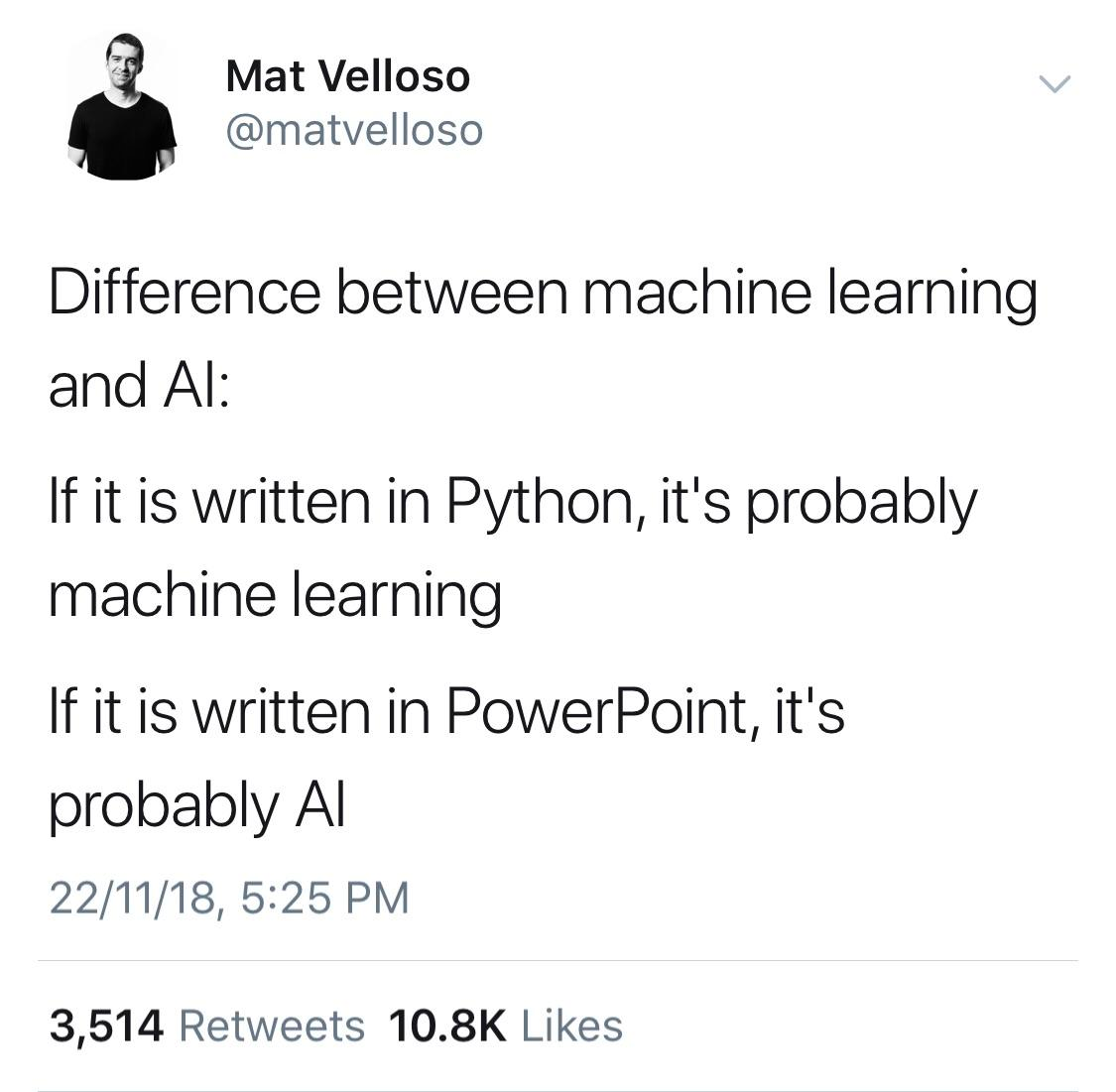
While those of us in these virtual rooms may make fun of the likes of Dominic Cummings for extolling a ‘Data Driven Approach’ to policy, the reality is that Data Science as a buzzword bingo term has survived and indeed thrived in a climate where ‘Artificial Intelligence’ is increasingly derided as being something that’s written more in PowerPoint than Python, ‘Machine Learning’ still gives people images of liquid metal exoskeletons crushing powdery puny human skulls, and those in management with long memories remember what kind of mess “Quantitative Analysis” got us into in 2008…
Way back in 2012, the Harvard Business Review described Data Science as “The Sexiest Job of the 21st Century”, and since then has been appearing in job specs and linkedin posts and research funding applications and business startup prospecta more than ever.
You’re not really doing tech unless you’ve got a few pet Data Scientists under your wing.

Like some kind of mythical creature, these Data Scientists sit somewhere between Wizards, Artificers, and Necromancers, breathing business intelligence into glass and copper to give the appearance of wisdom from a veritable onslaught of data, wielding swords of statistical T-tests, shields made of the Areas Under Curves, and casting magicks of Recurrent Neural Networks.

Like if Tony Stark and Steven Strange fell into a blender and the Iron Mage appeared, extracting wisdom from the seen and unseen worlds around them and project wisdom into the future….
But more often than not, it’s much more mundane…
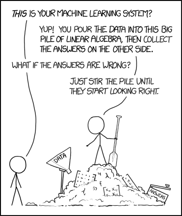
And it’s often in this mundanity of applying “standard” tools, techniques and analysis of data and stirring the pot until something interesting pops out that we are most likely to make mistakes, and that’s going to be the subject of this talk;


This isn’t going to be a technical Data Science talk, we’re not opening up Jupyter or firing up Spark or Tensorflow or whatever. We’re not even going to talk about Perceptrons or Hidden neurons or homomorphic cryptography. This is about people, processes, how to establish a healthy data science culture.
This is about numbers, aggregations, visualisation, and how you, as a Data Scientist, have a responsibility to look for logical pitfalls, and over time, curate that experience to constructively critique both your own analytical work, but also of the people, teams, and some times, executives around you.
Anyway, who am I to talk about this stuff?
Who am I ? (AKA you can skip this bit)
My professional background started off by getting robotic dogs to piss on headmasters in front of 200 primary school kids and taking things apart and always having a few screws left over (or loose) at the end.
I eventually turned that “skillset” into something of a trade, by studying electronics and software engineering at Queens.
As part of this I got to test the launch of 4G networks in China from the grey comfort of an office in Athlone, I moonlit as a technology consultant for a marketing and advertising firm in Belfast, used massive clusters of GPUs to optimise cable internet delivery, and spent a summer developing BIOSs for embedded computers in Switzerland.
After that, and just in time for the financial crisis to make everyone question their career choices, I continued down the academic culvert to do a PhD, stealing shamelessly from the sociologists to make their “science” vaguely useful by teaching autonomous military submarines how to trust each-other.
More recently, I worked with a bunch of psychologists and marketers to teach machines how to understand human emotions using biometrics and wearable tech as the only Data Scientist.
This being a small start-up, that meant I did anything that involved Data, so from storage and network administration to statistical analysis, real-time cloud architecture to academic writing, and everything in between. This also somehow involved throwing people down mountains and developing lie detecting underwear. Ahh the joys of Start Ups.
After that I got to be a grown up Data Scientist working in at a cybersecurity firm specialising in real time network intrusion systems, playing with terabytes of historical and real time data trying to read the minds of hackers and script kiddies across the world who are throwing everything they can at some of the internet’s biggest institutions. This was my first taste of being a Data Scientist who wasn’t working completely alone…
What about now? (AKA ‘Start reading here’)
After two years in that I got pinched to build a new team within an established Cyber Security group called WhiteHat Security, that had recently been acquired by NTT Security;
We have over 15 years of human expert trained data on if and how customer websites can be vulnerable to attack. We have teams of hackers working 24/7 to try and break peoples websites before ‘the bad guys’ do to prove that they’re vulnerable, and one way or another, we have those footprints of investigation, and the company wanted to start doing something with that data, so they needed a Data Science group, and they needed at team lead.
In the time that I’ve been here, we’ve gone from almost zero ‘practical’ Data Science, to ML representing 87% of all of the assessment actions that are going across our platform; Our group has also been contributing to next generation security data architectures with the Data Science Group as a critical future customer, rather than an opportunistic after thought, and along the way we’ve invented a couple of patents or patent worthy things that I can’t really talk about yet!
I’ve been there two and a bit years and while this isn’t officially a careers talk, all I’ll say is I’m still really enjoying the work, and we have roles open across our Belfast operations, and a placement scheme in the works that if anyones interested, some creative googling will get you there. Or just email me later!
In the time between when this talk was originally delivered and publication, a Data Science role was opened up for UK/Remote work
Lies, Damned Lies and Data Science
But anyway; what do I mean when I’m talking about all these mistakes and failures that churn around our feet every time we’re wandering through data?
Fundamentally, there are a few significant themes of ‘mistake’, where well intentioned, qualified, experienced and component subject matter experts can wield all the right tools in all the right ways and still come to an incorrect, or at least, incomplete conclusion given a certain set of data.
These fall into a couple of general areas:
- Causation Inversion
- Ignoring Contextual Features
- Over reliance on abstract measures of quality
- Premature Aggregation
Causation Inversion
This one has a few different names that I’m sure many of you have heard of, and I hope at least one of these has appeared in your course so far!
- Correlation does not imply causation
- Spurious Relationships
- Cum/Post hoc ergo propter hoc (with/after this, therefore because of this)
- Logicians and philosophers argue there’s a difference, I see them as similar fallacies under slightly contexts (consequential vs abstract correlation)
- “That thing where Nicholas Cage is Drowning People”
Put simply, Causation inversion is where you look at two or more variables observed over some dimension (usually time), and through the observation of some behaviour linkage, you can reasonably theorise that one variable is influencing the other.
While the ‘Nicholas Cage’ example gets a lot of attention, and without tripping over my own later topic of ‘Reliance on Abstract Measures of Quality’; the Nicholas Cage example ‘only’ has an r value of 0.66.
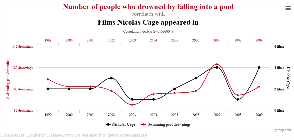
Also, visually, we can pretty clearly see that there are some counter-correlations, like around 2002 where Cage upped his output to 3 (namely, Windtalkers, Sonny, and Adaptation). That year, drownings in fact reduced, contra-indicating the hypothesis that they are directly correlated.
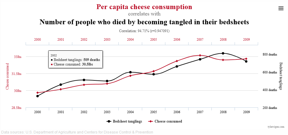
A much more quote-unquote “convincing” correlation is this one. It’s got an r of 0.95 which is pretty good I guess, and it certainly looks like they’re going the same direction.
In the real presentation, which was a bit of Audience Participation where different parts of the below graph were exposed with guesses from the audience of what could be under the cards; that really doesn’t work in text…
Remember, the point here isn’t “lol, graphs go burr” or even “r-values suck”, but we’ll come back to that.
The critical issue here isn’t anything to do with the numbers; it’s about you, as a quote-unquote “subject matter expert”, looking at the numbers, performing some reasonable analysis, and declaring “Cheese is killing people”.
We can make fun of this to a certain degree with the cherry picked examples I’ve put us through here, but causation inversion is lurking at the bottom of every time a manager, executive, client, or colleague asks you a question; always be aware that just because two factors are correlated, there’s no requirement in the universe that says that that means one leads to the other.
Infact, more often than not, these kind of spurious or coincidental correlations indicate some other factor lurking under the surface that you’re not taking account of in your modelling.
Which leads us nicely into….
Ignoring Contextual Features
This is another one with many related names; Simpson’s Paradox, Lords Paradox, the Suppressor Effect.
Simpsons Paradox
Simpsons Paradox is a fun, weird, and occasionally disturbing consequence of the old “Lies, damned, lies, and statistics” adage.
Fundamentally, Simpsons Paradox is the effect where identical data can be used to support directly contradictory conclusions, if the context or causality of the underlying data is not taken into account.
This is commonly summarized in the two charts below; from the first graph, it’s obvious that there is a tightly correlated positive linear relationship between the X and Y values, you’d have to be blind to say anything else. However, due to some underlying structure or sub-divison of values, the relationship can be totally flipped.
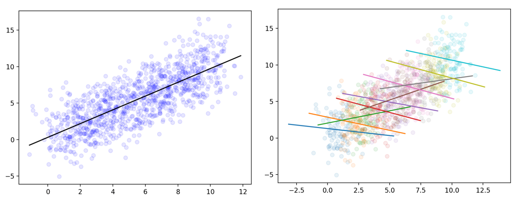
Using exactly the same values, depending on how or if we slice, group and aggregate our data, we can come to two totally opposite conclusions, with total statistical justification.
Real World Research Case - UC Berkeley
But what does this really mean in real life? One of the most famous examples of this paradox is the 1973 investigation into allegations of bias in the admissions criteria of UC Berkeley.
From the data presented below, it is once again Obvious, and Self Evident that a higher percentage of men were admitted than women. It can be graphed easily, the aggregations seem ‘fair’,’obvious’ and ‘natural’; all we do is we take a count of all the men who applied, all the women who applied, and in each group, calculate the percentage that were successful.
- | Applicants | Applied | Admitted | % Success |
- |:—
- —
- —
- -:|:—
- —
- -:|:—
- —
- –:|:—
- —
- —
-
Men 19186 8442 44% Women 12346 4321 35% Total 31129 12763 41%
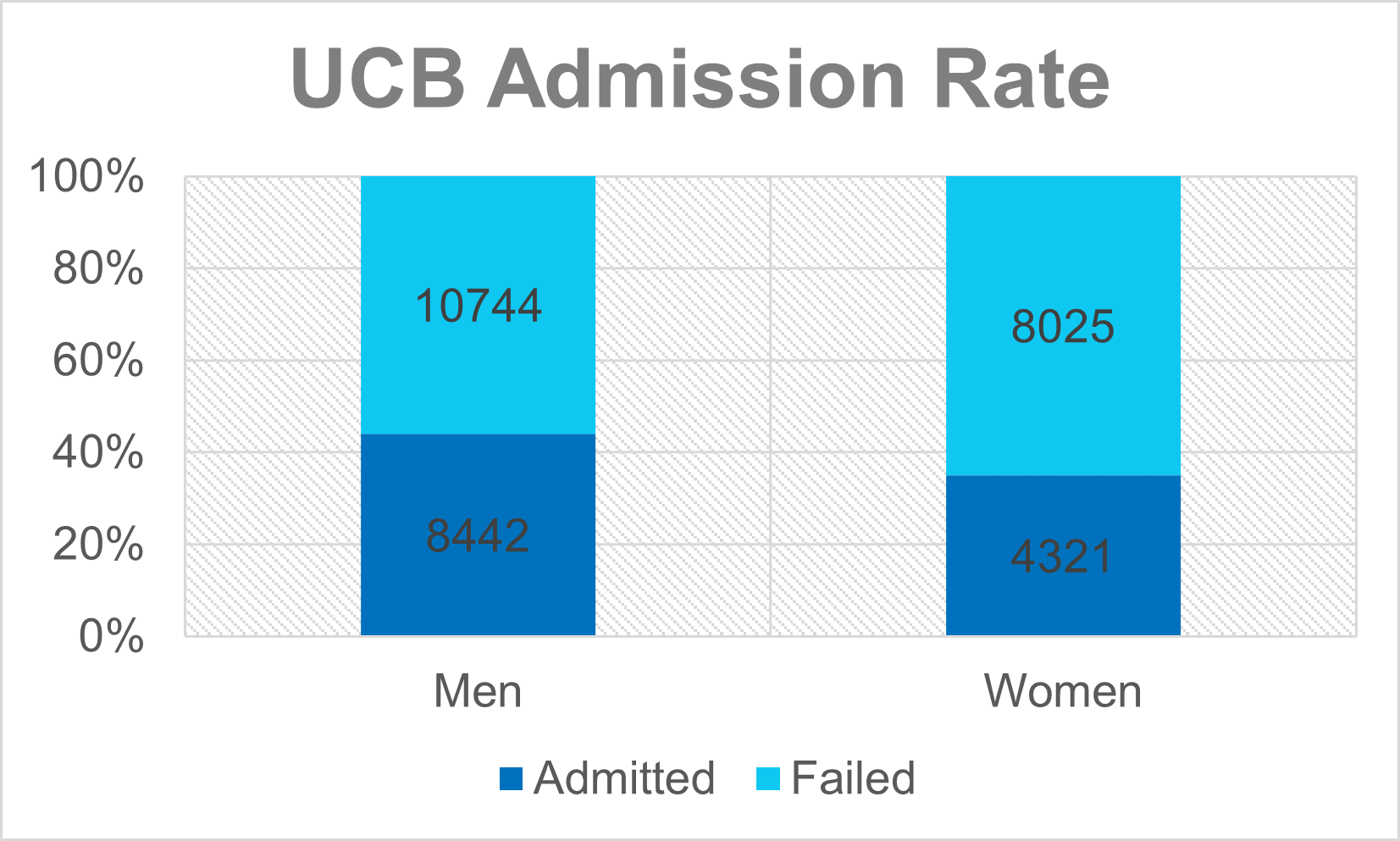
Job done, fire the admissions board, issue a public apology and go home.
But not so fast! When researchers dug into the totals and looked at each department (presumably to find someone to blame at a lower faculty tier…), they found something surprising; in the most popular and highest intake departments, if anything there was a bias towards female applicants.
- | | Total | | | Men | | | Women | | |
- |:—
- —
- —
- -:|:—
- —
- -:|:—
- —
- –:|:—
- —
- —
-
|:—
-:|:— — –:|:— — —
-
|:—
-:|:— — –:|:— — —
-
Department Applied Admitted % Success Applied Admitted % Success Applicants Admitted % Success A 933 597 64% 825 512 62% 108 89 82% B 585 369 63% 560 353 63% 25 17 68% C 918 321 35% 325 120 37% 593 202 34% D 792 269 34% 417 138 33% 375 131 35% E 584 146 25% 191 53 28% 393 94 24% F 714 43 6% 373 22 6% 341 24 7%
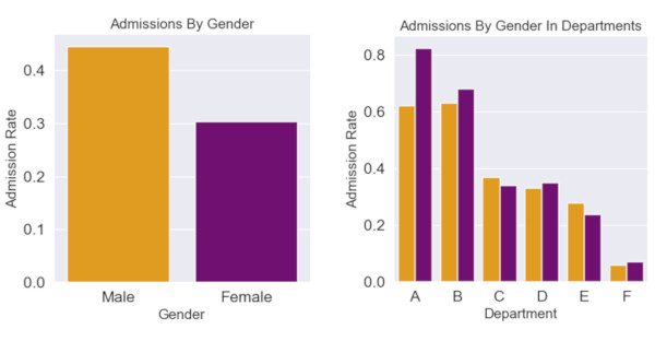
The researchers instead concluded that what was happening was that women were applying to more competitive departments, and that men were going for ‘less risky’ fields. Note in particular that the most popular departments for women (Dept C/E) had both a significant difference between numbers of male and female applicants, and indeed, had some of the lowest overall admission rates.
A word of caution here before we move on however; I’m going to quote Curtis Wilson, one of the statisticians in the Data Science Group at NTT in response to me talking about Simpsons Paradox in work;
Its always worth mentioning with the UCB data that this doesn’t show there isn’t a bias at play. The follow up questions should be “why do the departments which appeal to women more than men have lower admission rates? Is this related to historical under-funding?”. General lesson: we’ve identified we have subgroups that behave differently, so now we need to ask why they behave differently.
So, as we said, the moral of the story is, be careful what causal or narrative explanations you use your data science skills for, and always try to dig down to make sure you can understand and contextualise the origins and intentionality of the data you’re using.
Practical Business Case - It’s In Your Jeans
What about instead of retroactive research we’re operating as a start-up and using data to plan our go-to-market approach? Let’s say we’re wanting to sell jeans.
Since we’re fairly conventional folks and we don’t want to get into the bespoke sizing game, and that instead we’re going to try and produce the simplest jeans that fit the most people.
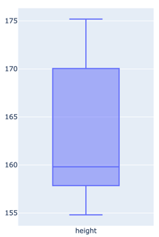
And we’re all very clever and data driven so we’re going to experiment by taking a sample of a population, and measure their heights. Thanks to good old Leo Davinci, we can assume that the optimal jean length is roughly half the height of the individual. And we can arbitrarily define a ‘comfort tolerance’ of plus/minus 3cm.

To make sure we’re comfortable with the numbers, we’ll start with a small scale and ramp up as we need to.
| | height (cm) | |— |— — — —
-
A 155.06 B 157.83 C 173.85 D 158.78 E 170.03 F 160.80 G 175.18 H 158.58 I 168.70 J 154.79
So, with our sample of 10 people, we can do a few easy things first;
We can identify that our tallest individual is 175cm, roughly 5’9”, and shortest is 154cm, so around 5’ nothing.
We can take a straight average by adding up all the values and dividing that by the number of individual values, so in this case we end up with 163cm, or around 5’4”
Now, there’s another measure we could use that we’ll include for simplicity; the Median; this is a dark and magical term which basically means “if you sorted all the values, which one would be in the middle”. Another way to think about it is that if you pink the correct ‘median’ value, 50% of the values will be higher, and 50% will be lower. And that way we end up with 160cm.
This is important to flag; not all ‘averages’ are created equally, but that’s a story for another day.
So, big question at the end is “How big is our potential market share if we go with the average?”.
10%. Only one member of our sample could actually wear our ‘average’ jeans.
Spoilers, but exactly the same problem was found when the USAF attempted to find the ‘average’ pilot to design the Goldilocks of cockpits. Instead, they decided to make everything customisable.
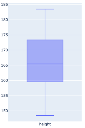
But maybe we just don’t have enough data; so let’s try again. This time we spend a load of money to measure 3,500 people and we go through the same exercise coming up with hopefully more generalised numbers: this time we get an Average of 166cm and a Median of 165cm, which is pretty convenient and could be used to imply that our data set was nicely balanced and we didn’t have any significant ‘ lumps’ in our data. And this time, we get a new ‘coverage’ of 20%, great! But can we do more?
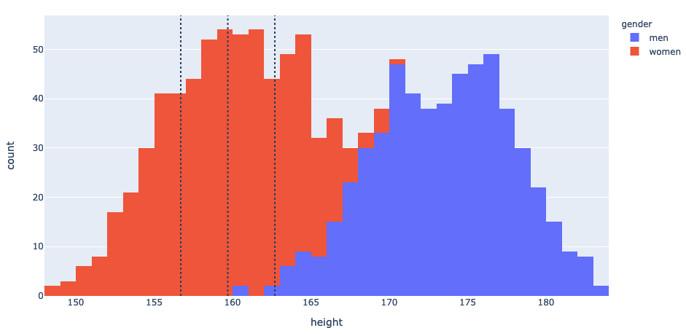
Instead of looking at the data as 1-dimensional measurements, we can use a histogram to count how many people were measured at particular heights. We can also superimpose our ‘comfort range’ to get a visual clue of what we’re actually covering here.
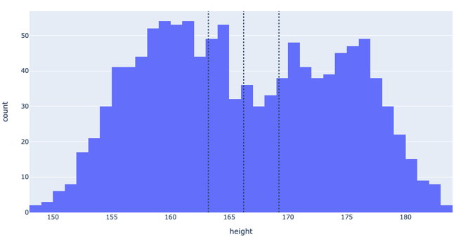
But now I think we can see the problem; we’ve got the average and median heights, but they’re not the most popular heights in the sample. And looking at the ‘camel humps’ distributions (otherwise known as a bimodal distribution), we might be able to infer that there’s an underlying structure that we’re missing.
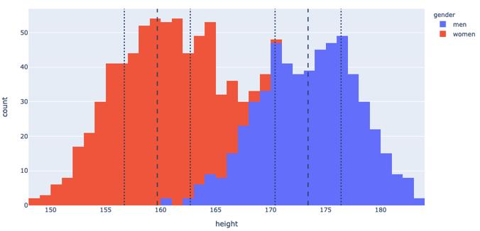
And we’d be right! The hump on the left constitutes predominantly women, and the hump on the right constitutes predominantly men.
If we instead shift our window to target the average woman, we up our coverage to 26%, and if we slightly compromise on our initial ‘one size fits all ‘vision and make a mens version as well, we can up our coverage to 49% of the market, much more healthy for the investor meeting.
The Alabama Paradox - Even When You’re Right; You’re Wrong
There’s a related phenomenon that if anyone watches the Stand-Up-Maths channel with Matt Parker on YouTube, which isn’t so much a data science thing as a strange quirk of mathematics that appeared in Political Science, and while this is a bit of a segue, I won’t go too far into the weeds;
Basically in the United States, the House of Representatives is supposed to be… representative; that is, the number of seats allocated (or, apportioned) to each state should be proportional to the population of that state. Seems pretty simple; take the population of state, divide by the population of country, multiply by the number of seats in the chamber, and get the job done; right?
Oh, ok, except for the decimals… Ok, so just round things then and we’re done, right? And all these steps that we’ve taken are objectively, demonstrably, fair? Right?
Well, not quite; Matt tells it better than I do, but the top line is that there are circumstances where changing the number of seats had unexpected results, specifically in 1800 when it was discovered that increasing the number of seats in the house from 299 to 300 would in fact reduce Alabama’s apportionment from 8 to 7, significantly reducing the ‘representation’ of that state.
From Wikipedia;
An actual impact was observed in 1900, when Virginia lost a seat to Maine, even though Virginia’s population was growing more rapidly […]
Also from Wikipedia, here’s a little simpler worked example to think it through; 3 ‘states’, 14 ‘people’, 10 seats, and we can all do the rounding so this all looks legit,
Until; Some pesky legislator says we need more seats, citing something like ‘fairness’ or ‘I like prime numbers’
And State C suddenly goes from 20% of the representative body to a 9% representation.
| | | With 10 seats | | With 11 seats | | |— —
-
|—
|— — — — — |— —
-
|—
-
|—
–| | State | Population | Fair share | Seats | Fair share | Seats | | A | 6 | 4.286 | 4 | 4.714 | 5 | | B | 6 | 4.286 | 4 | 4.714 | 5 | | C | 2 | 1.429 | 2 | 1.571 | 1 |
What does this have to do with Data Science? Bear with me, because I’ve seen this happen in the wild, and it’s a strange one; multi-label classification tasks.
I was working on a system to detect and classify emotional states in humans from biological markers like heart rate, breathing rate, galvanic skin response, vocal timbre, and acceleration over time. Sounds like fun, and it was, and when we were doing continuous mapping, i.e. we had a vectorised emotional space such that we could project any ‘emotion’ into a series of coordinated in a projected space, and then ‘map’ those values back out to something also continuous, like colour space, or even an ‘emotional noise generator’ that a colleague had trained.
All was well until someone said “Yeah, this is cool and all but I want it in words”; so we started off with the classical “Ekman Seven” of Anger, Contempt, Disgust, Enjoyment, Fear, Sadness and Surprise”, and got to training.
There was a wealth of training and academic data around these so this was quite positive and smooth. Until someone wanted us to add an eighth; ‘Contentment’.
Long story short, by adding an additional label option to our classifier, we in fact reduced the overall trained accuracy of our classifier, and when we eventually dug around, we found that it was exactly this kind of ‘rounding’ issue that was confounding our training. Since then, I keep an eye out for any time that labels are being changed….
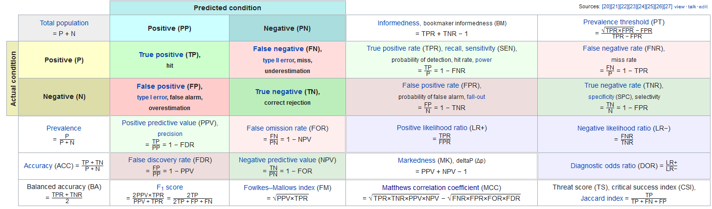
Over Reliance on Abstract Measures of Quality
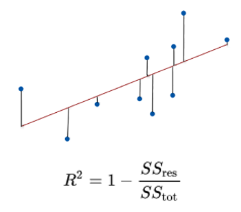
Speaking of measuring performance, one of the hairiest parts of Data Science is quantifying the ‘quality’ or ‘accuracy’ of data. One such metric of quality we mentioned earlier was the r-value. It’s technically the ‘r-squared’ value but thats a pick we don’t need to nit today.
R-values range from 0 to 1 and are usually interpreted as summarizing the percent of variation in a given metric that is ‘explained’ or ‘correlated’ to another metric or value. So, before, when Nicholas Cage was Drowning people, one interpretation is to say that Nicolas Cage Movies explain 66% of the variation in pool drownings.
That 66% sounds like a strong-ish correlation, but as we saw, it’s not great; but equally, we saw that the really super high 95% correlation in Cheese consumption didn’t actually mean anything.
Many will be familiar with the often quoted XKCD about standards, but the same thing can be said about quality metrics; there are a wide range of them that mean different things, and hopefully, some of these will already be familiar to you.
An easy one is ‘accuracy’, or ‘how many times did you get it right?’.
This is a clean, simple, management friendly metric, and nothing could possibly go wrong with something so simple?
At NTT, one of the projects we’ve delivered this year was a machine learning derived model for verifying if a website might be vulnerable to particular kinds of attack. As part of the training for that, we took over a decade of human labeled and scored instances of true and false vulnerability observations across a huge swath of the internet. I believe it was on the order of a hundred million individual ‘samples’. So, we fired up the GPU’s and let it run wild, optimising for the ‘accuracy’ metric.
On our first few passes something strange happened; we kept getting really high, more than 95% accuracy scores. In any normal environment, that would be a great success and then we would go home and take a month off and wait for our bonuses to roll in.
But, thankfully, we’re a sceptical bunch and we dug a bit deeper; basically, we were getting every single ‘false’ assessment correct, i.e. ‘this website does not have this vulnerability’, but we were incorrectly marking the ‘true’ cases, the ones we actually really cared about as ‘false’.
However, because in the real world, the real occurrence of vulnerabilities is thankfully rare (and thanks to products like ours, generally short lived), we had what is called a biased sample set. The ‘False’ set dwarfed the ‘True’ set. And because we were at that time looking to optimise accuracy, we succeeded in failing miserably.
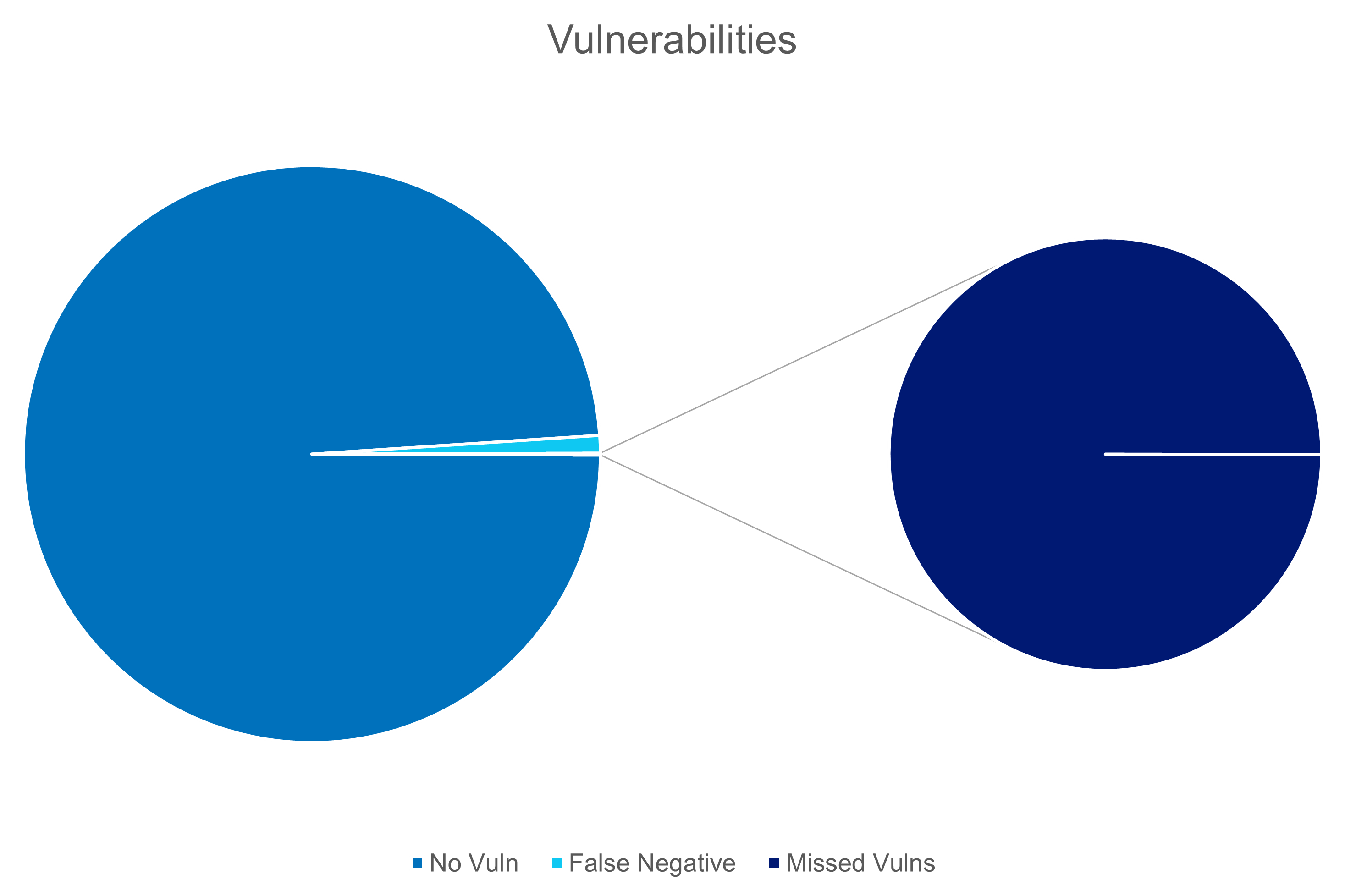
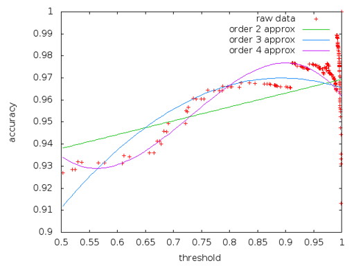
Thankfully there are other metrics; lots of them. And I’m not going to suggest you need to use them all, but in our case we evaluated the measures, conferred with our domain experts, and our product team to work out what behaviour and tolerances were actually desirable, and settled on the [Matthews Correlation Coefficient(https://en.wikipedia.org/wiki/Phi_coefficient)] as the optimal target for that particular training task.
If we’d blindly deployed our Accuracy models, I’d almost certainly not have a job anymore!
Premature Aggregation
Finally, we come to my personal bug-bear of this line of work; premature-aggregation.
8 out of 10 executives suffer from premature aggregation at some point in their careers. It’s nothing to be ashamed of, and you can seek guidance for how to resolve it.
With complex systems, the urge to simply roll everything up and take an average is strong, but as we saw in the jeans-example, sometimes the average isn’t the best approach, and that you simply should not hide a certain level of detail.
However, where you set that detail is a slippery slope, and I don’t have any hard and fast rules for you, so I’ll lay out a few examples;
Lets talk about that jeans example again; last time we saw it, we were down to breaking up the decision space into three factors; height, count, and gender;
We already recognised that we’d ‘prematurely aggregated’ by not taking gender into account and just looking at the average and hoping for the best. But fundamentally, each one of these blocks in the histogram are made up of individuals, and individuals have all kinds of characteristics that we could dive into. So how do we know when to stop? Fundamentally, you’re just going to have to learn to make that judgement from experience and context. For instance, we could dive a little deeper and look into the influence of race into height distribution.
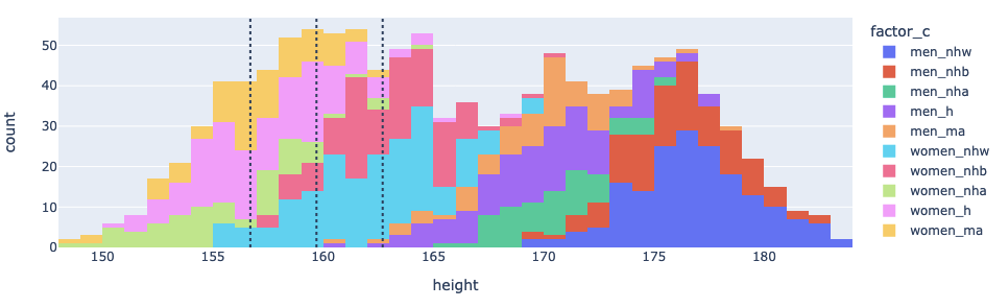
However, as you can see, it ends up being a bit of a mess. Part of this comes down to the choices of visualisation, but fundamentally; people are messy, and generally, the world is messy.
In these kind of situations, I try to go back to the motivation for any study or analysis I’m conducting; am I trying to convince someone of something? Am I trying to improve the performance of some process? Or am I trying to sell jeans to the most people.
From the data above, while there is significant variation in overall racial morphology, the ‘signal’ is nowhere near as strong as the Gender factor, and since race or ethnicity means nothing to whether and individual can wear jeans or not, it’s an unnecessary detail to the business case and we can say we’ve reached our ‘optimum level of aggregation’.
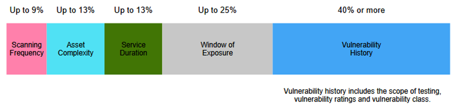
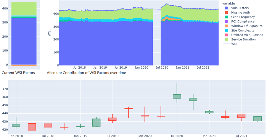
In my own work we had something similar. We have a scoring system, much like a credit score, that is intended to be an honest, representative, comparable measure of the ‘security hygiene’ of a website. It consists of 8 factors which aren’t massively important to the point, however they are (currently) presented monolithically, and of course, both the customers and our support teams were chasing this metric and were generally quite unhappy any time it went down, or even, didn’t go up.
For anyone keeping track of “Internet Law Bingo”, what comes next is Goodhart’s Law;
When a measure becomes a target, it ceases to be a good measure.
Without any significant thought, these ‘credit scores’ were simply averaged across a wide range of client assets, big, small, financial, gaming, healthcare, customer facing, internal, what have you, and for a significant period of time, executives chased this number and were…. disappointed… when they couldn’t “game the system”.
In an attempt to combat this, our group have been working with the front end teams to unpack that premature aggregation, and to better share and explain that no, a single number doesn’t express the ‘hygiene’ of your entire company.
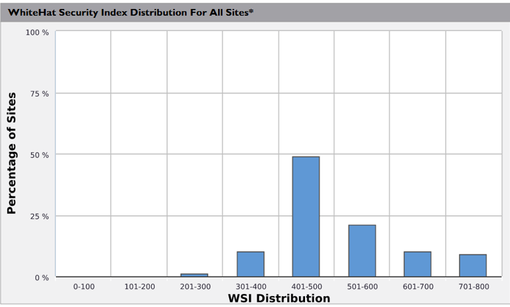
For example, this is the distribution of different sites under a particular clients control.
Now, for context, the theoretical maximum for this particular index is 800, and this particular client had the highest proportion of ‘near perfect scores’ of any of our clients.
But, their security and executive teams were primarily focused on one thing. Their average score of 592, which put them largely in the middle of the road for high end clients based on our earlier distribution; far from stellar but pretty good, which just didn’t reflect their actual security posture.
What’s more galling from a Data Science perspective is that their 25-odd sites that were dragging down their average by over 100 on their own were all copies of the same site for different regions so had the same vulnerabilities, so fixing 3 vulnerabilities on that ‘one’ application on those 25 sites could have upped their scores, instead of fiddling around with their high value, and already highly scored, sites.
Conclusion
And with that, that’s it, we’re finally at the end. We’ve reviewed how just because metrics are correlated doesn’t mean they cause each other, that the devil is very often in the details in terms of measuring patterns and in dividing classes; that you need to be as careful in your choice of measures as in your data, and finally that it’s important to pick the appropriate level of abstraction, lest you lose the impact of what your analysis is trying to say.
There’s a quote floating around (generally attributed to British Economist Ronald Coase);
If you torture data long enough, it will confess to anything you’d like
Being data driven is one thing, but when working with data, we need to also understand the underlying structure of the systems and phenomena that we’re measuring, planning, and deciding on. All the storage space and GPU time in the world won’t save you from screwing up bigly if you don’t know your problem domain.
Thanks for your time, and if you have any questions, I’m on twitter as @bolster and I’ve email addresses littered over the internet so google me!
Postscript
As part of the generation of film posters, I had a suggestion in from Jon Reese and Amy Pearson and had to make it, so here’s a freebie.