My Basic (Python) Data Science Setup

Andrew Bolster
Senior R&D Manager (Data Science) at Black Duck Software and Treasurer @ Bsides Belfast and NI OpenGovernment Network
After last weeks return to posting, I thought it was time to do something vaguely useful (and actually talk about it) so I’m tidying up a few meetup sessions I’ve presented at into a series of Basic Data Science (with Python) posts. This is the first one and covers my Python environment, the Jupyter notebook environments I use for analysis, and some on the Plot.ly graphs and RISE / Reveal.js methods I use to turn those notebooks into presentations.
This section will be “Light” on the data science, maths, politics and everything else outside of the setup of this wee environment.
Assumptions
- Basic Linux/OSX familiarity (This setup was tested on Ubuntu Server 17.04, YMMV)
- Basic Programming familiarity in a hybrid language like Python, R, Bash, Go, Rust, Julia, Node.JS, Matlab, etc.
- That when I use the phrases “High Performance”,”Large”,”Big”,”Parallel”, etc, this is in the context of a single, small, machine processing small amounts of interesting derived data. Yes, we can go big, but for now lets start up small…
TL;DR
- Download Anaconda Python 3.X
wget https://repo.continuum.io/archive/Anaconda3-4.4.0-Linux-x86_64.sh -O anaconda.shchmod +x anaconda.sh./anaconda.sh
- [OPTIONAL] Set up a
condaenvironment to play in;conda create -n datascisource activate datasci
conda config --add channels conda-forgeconda install numpy scipy pandas nb_condaconda install jupyter_nbextensions_configurator nbpresent nbbrowserpdf plotly seabornpip install cufflinksconda install -c damianavila82 risejupyter notebook --ip=0.0.0.0
Python
If you’re using something else to do Data Science, good for you, but in terms of flexibility, developer/analyst velocity and portability, Python is hard to beat. R still has Python beat in some of the depths of it’s Statistics expertise, but IMO Python gets you 99% of the way there.
My environment of choice uses the Anaconda distribution. Its largely pre-built and optimised modules, communuity maintained channels, and environment maintence capabilites make it hard to beat for exploratory analysis / proof of concept without the overheads of containerization, the pain of virtualenvs or the mess that comes from sudo pip install
I’ll skip past the installation instructions since Anaconda’s installation guides are pretty spot on, and we’ll swing on to some tasty packages.
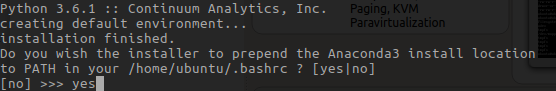
NOTE in most cases, when the Anaconda installer asks “Do you wish the installer to prepend the Anaconda3 install location to PATH…?”, unless you craft your own dotfiles, it’s a good idea to “yes” this
If you want to keep all your datascience environments tidy, or you just want to minimise cross-bloat, conda makes environment creation and management extremely easy
conda create -n datasci
source activate datasci
This way, you’re not mundging over the base python installation, and best of all, everything lives in userland so this is great for shared machines where you don’t have sudo access.
Once the base distribution is installed, it’s also worthwhile adding in the conda-forge channel, which gives you access to community built and tested versions of most major Python packages (and can be more up to date than Anaconda’s pre-built versions)
conda config --add channels conda-forge
Numpy and Pandas and Scipy, oh, my!
There are a few fundamental challenges in Data Science that can be loosely grouped as:
- Extraction, Collection and Structured Storage of Mixed Value/Format Data
- Slicing, Dicing Grouping and Applying
- Extraction of Meaning/Context
The first two of these are made massively more comfortable with the addition of 3 (large) Python packages; numpy,scipy and pandas.
numpy and scipy specialise in highly optimised vector-based computation and processing, allowing the application of single functions across large amounts of data in one go. They’re both very tightly integrated with eachother but in general, numpy focuses on dense, fast, data storage and iteration, with a certain amount of statistical power under the hood (most of it from scipy), and then scipy focuses on slightly more ‘esoteric’ maths from the scientific, engineering and academic fields.
Without a doubt, pandas is my favourite Python module; it makes the conversion, collection, normalisation and output of complex datasets a breeze. It’s a little bit heavy once you hit a few million rows, but at that point you should be thinking very carefully about what questions you’re trying ask (and why you’re not using Postgres/Spark/Mongo/Elasticsearch depending on where you are).
So, enough introductions;
conda install numpy scipy pandas
Drops of Jupyter
While pandas is still my favourite module, jupyter probably makes the biggest difference in my day to day life. Oftentimes you will either be living in a text editor / IDE and executing those scripts from the command line, or running through a command line interpreter directly like IDLE or ipython. jupyter presents a “middle-way” of a block-based approach hosted through a local web server. Go play with it, you’ll thank me.
While the base jupyter module is packaged as part of Anaconda, a collection of helper modules in inluded in the nb_conda package that includes features such as automatic kernel detection among other features
conda install nb_conda
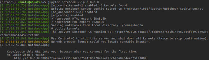
jupyter notebook --ip=0.0.0.0
The --ip=0.0.0.0 sets the jupyter server to accept connections to all addresses; by default it will only listen on localhost
On first time launch, you’ll need to connect with a tokenized url
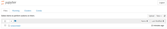
After visiting that URL, you’ll be presented with Jupyter’s file-tree based browser view:
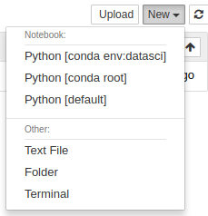
From here we can launch “notebooks” from a range of kernels; the datasci conda environment we just created, the “root” conda environment (not “root” as in “superuser”, “root” as in the base, user-space, conda installation), and the system default python version.
You can fire up the datasci environment to get into the new notebook view, where Jupyter really comes into its own.
As you can see, the “output” (stdout / stderr) is redirected from the cell scripts into the browser. This is gets particularly powerful as we start to use more complex functionality than just “printing”.
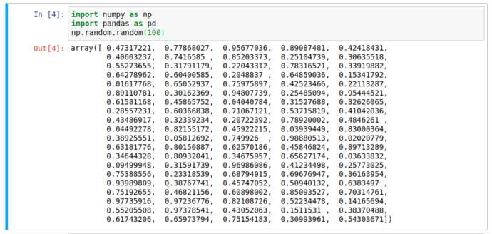
Notice the lack of print function; we still got the output we expected. But it’s still text and not that pretty; here’s where pandas comes in…
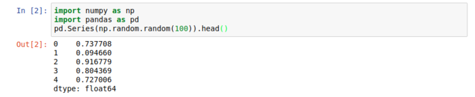
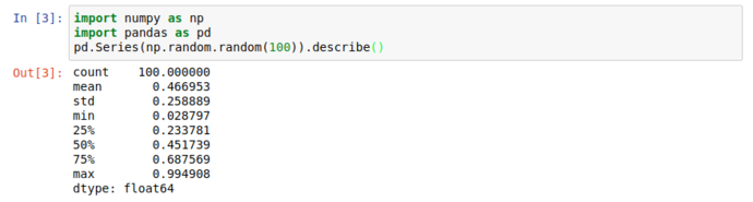
When working with large datasets, “accidentally” filling the screen with noise when you just want to peek into a dataset is an occupational hazard, so all pandas collection objects have .head() methods that show the first 5 (by default) results. Unsurprisingly, there’s also a tail, but more interestingly; there’s a .describe() that give you a great general rundown on the nature of the dataset.
But who needs numbers when we can have graphs?
Jupyter supports a wonderful meta-language, helpfully called “magic functions” that give lots of access to the innards of Jupyter. One handy one is the %matplotlib function, that lets you tell Jupyter how to interpret matplotlib plot objects. %matplotlib inline essentially says “make it an inline png”
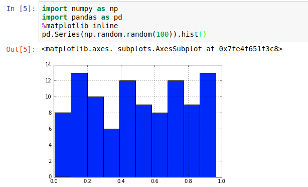
That’s fine for fairly constrained plots like histograms; if we’re dealing with some kind of long-term varying data (eg timeseries), it’s not ideal to try to “navigate” a static image.
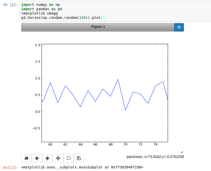
Instead of inline; using %matplotlib nbagg instructs jupyter to set matplotlib to use a heavily customised backend especially for notebooks, that brings interactive spanning, zooming, translation and image export.
(Note, when switching between inline and nbagg, the kernel has to be restarted using the relevant button in the toolbar, this will keep all your code and cells and outputs, but will clear any stored variables)
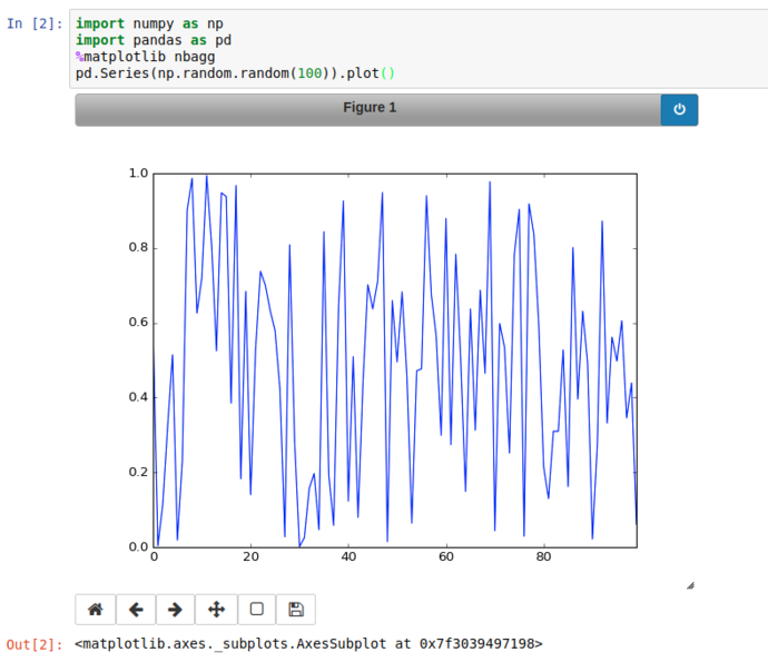
Using the Pan button on the bottom right of the plot, we can zoom into a particular area of the graph and export it if we like.
So far so meh; what about something vaguely realistic?
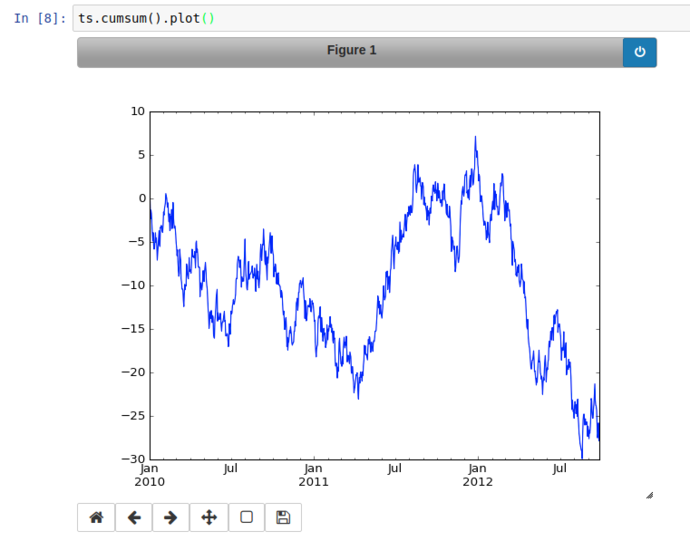
Using numpy’s random modules, and pandas.date_range functionality, we can generate a (basic) simulation of the daily up/down movements of a financial market;
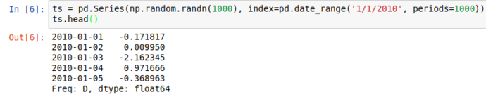
From there’s it’s a hop and a skip to use the Series’ cumsum() method to get a simulated price change from the launch and plot it (with proper time-series x-axis labels!)
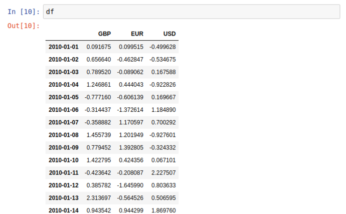
Similar (but far nicer) than the Series display, this 2 dimentional dataset (DataFrame) has a very clean and readable representation in jupyter
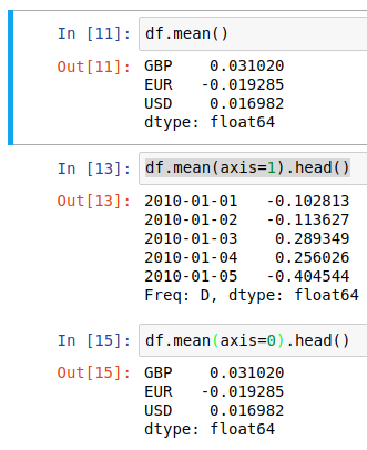
Two things to point out before we move on; dimensional aggregation and column creation;
df.mean() by default returns the average value of each column, but this behaviour can be made explicit or transposed through the axis argument;
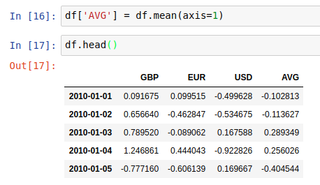
And then we can use the output of axis=1 to create a new “AVG” column in the dataframe in place
Mixed Cells, Presentations and RISE / Reveal.js
For presentationy stuff later though, I like to add in a few extras, this first batch is related to extension management, pdf export and introducing Jupyters Presentation capabilities, in particular, RISE which greatly augments Jupyters’ presentation capability, bringing in the popular reveal.js presentation framework.
conda install jupyter_nbextensions_configurator nbpresent nbbrowserpdf
conda install -c damianavila82 rise
This also gives us an opportunity to experiment with the multiple cell types that Jupyter gives; (It’s not all about code!)
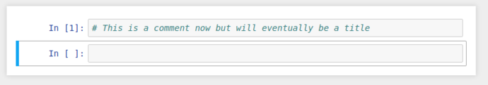
This regular boring comment could also be considered Markdown, if only we could tell jupyter…
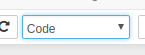
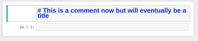
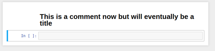
By selecting the cell, and switching the cell type from the dropdown to Markdown, it’ll re-display as giant blue text while in edit mode, and when you “run” the cell, it’ll be rendered as a markdown title.
So we’ve got markdown, now to get presentations; in default configuration, we need to enable the “Slideshow” cell toolbar.
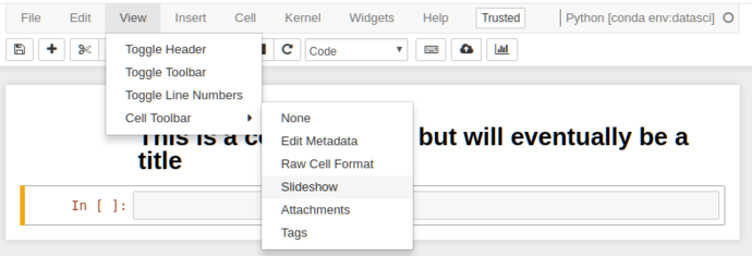
This adds an extra toolbar to each cell that allows you to control the slide state of that cell (this will make more sense in a sec)
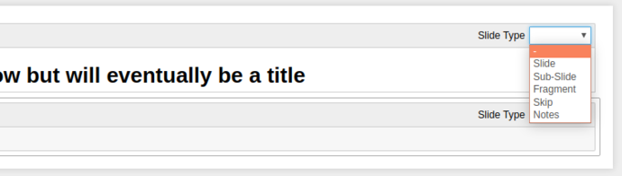
This dropdown gives 6 options for what kind of slideshow behaviour that cell has;
-
-: Direct continuation, i.e. this cell will be considered part of the above cell (useful for mixing Markdown and Code in the same slide) -
Slide: Make this a primary slide in theReveal.jsslideshow. -
Sub-Slide: Make this a secondary slide (i.e. slides “below” the primary slides) -
Fragment: This cell will “appear” on the element above, think of it like an “appear” transition in Powerpoint/etc. -
Skip: Simple enough, these cells aren’t shown. -
Notes: These cells are used for Reveal.js Speaker Notes, YMMV and they don’t work with the native Jupyter integration, so I’ve never used them.
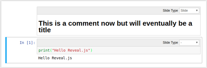
Using a combination of these, we can turn our mixed Markdown/Python notebook into a slideshow including code-outputs:
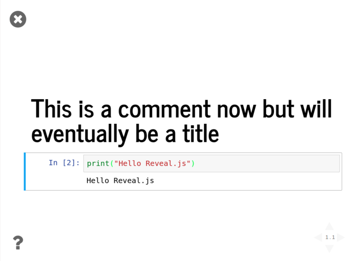
Click the “Enter/Exit Live Reveal Slideshow” button on the top toolbar (Or Alt + r)

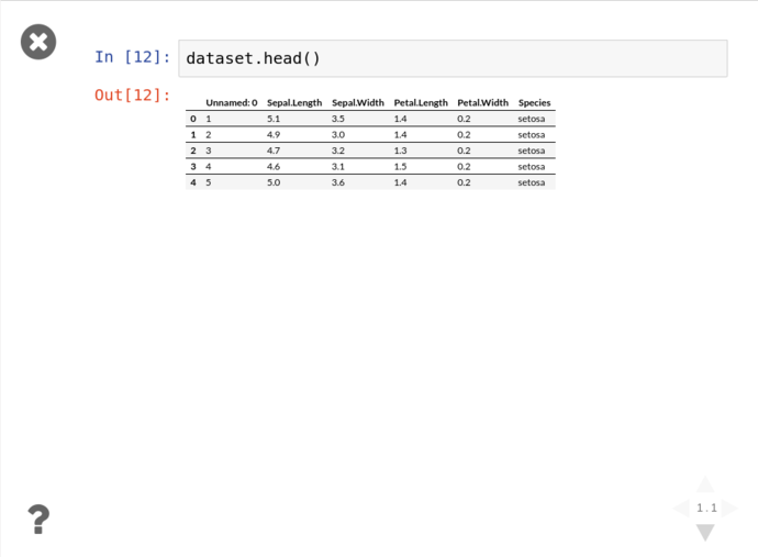
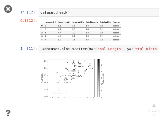
Using these tools and the Pandas functionality from above, we can quickly grab the iris dataset from Vincent Arel-Bundock’s RDatasets repository and start graphing things almost instantly without showing all the gubbins in the presentation;
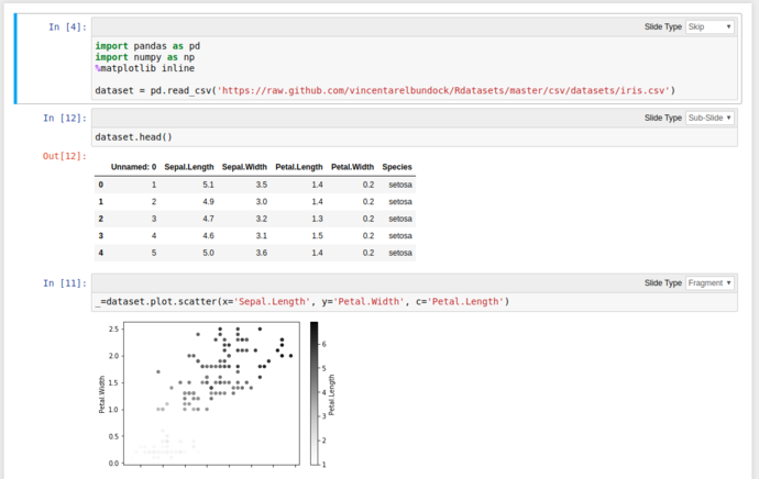
Then click either the arrows on the bottom right, or PgDn to reveal the next fragment
Graph all the things
One of the key parts of interrogating and analysing a dataset is visualisation. Python has a pile of fantastic visualisation libraries, with matplotlib being the granddaddy of them all (and is a dependency of most numerical libraries because it’s handy as hell). But that’s not our only option by a long shot.
Personally, I’m a fan of Seaborn for pandas aware static plots, and Plotly for generating rich, interactive, shareable visualisations (like this one, presented with no context)
Plot.ly’s getting started instructions are spot on so I’ll not dive too far into them and go straight on to using it.
NOTE cufflinks is a brilliant little bridge between pandas and plotly, creating an overloaded iplot() method on Series and DataFrame objects. Unfortunately it’s not in the default conda distribution so we have to pip it the old fashioned way.
conda install plotly seaborn
pip install cufflinks
But before we completely ignore that iris dataset, we’ll gently fire it at seaborn to get something interesting;
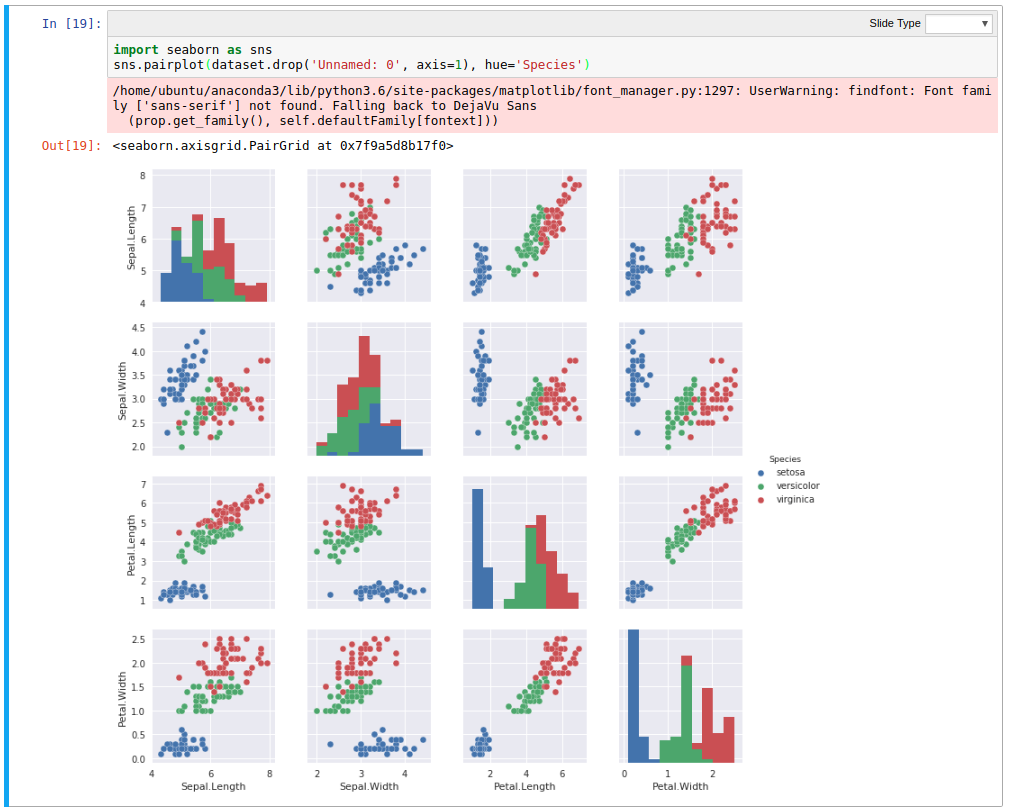
Using the hue argument gives much higher clarity on the delineation between the species, and for wide datasets like this, seaborn can infer what columns to plot against, allowing rapid inspection of relationships in data.
Conclusion
And that’s about it!
I’ll try to keep this page updated with “my ‘best’ practice” setup and workflow. Slap me around if I’ve messed anything up in these instructions, or to comment on how I’m totally wrong!
Also if you’d like to see a few examples of presentations / notebooks I’ve used, checkout present.bolster.online. The source for these is also available on github at presentgh.bolster.online.
If there’s a decent level of interest in this, I might put together a proper course for this stuff, lemme know if that’s something that’d be useful! (Otherwise I’ll just keep ranting at Meetups!)
:trollface: